
18 The Enhanced Context Menu
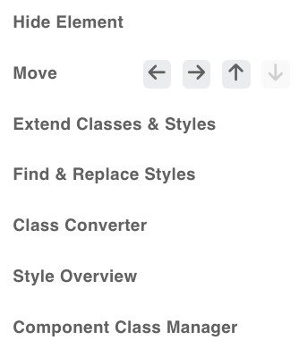
Right-mouse-click on one of the elements in the Structure Panel and seven new options are shown.
- Hide Element
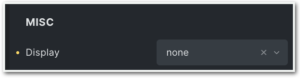
When you choose “Hide Element” an Icon will show on the right-hand side from the Element in the Structure Panel. On the left in the Style Panel’s Miscellaneous, Bricks will change the display to None.
To undo simply click the ‘hide’ icon.
- Move
We now have the flexibility to easily move elements within the structure panel using either keyboard shortcuts or the contextual menu. The movement options include shifting active elements up or down among siblings or altering the indentation position by moving them left or right. - Extend Classes & Styles
When you want to apply style changes to multiple elements in Bricks, you either have to duplicate each element (and adjust the content for each) or copy/paste classes and styles manually. But now, Advanced Themer brings in an “Extend” feature that allows you to apply styles and classes from a specific element to multiple targets swiftly. This will give you the ability to extend the global classes and styles of an element to its parent or children. For instance, you start styling an element at the ID level and then discover you forgot to create a class. -
Find & Replace Styles
By clicking on the “Find & Replace Styles” option a modal will show, either as a left sidebar, a right sidebar, or a full-screen modal.
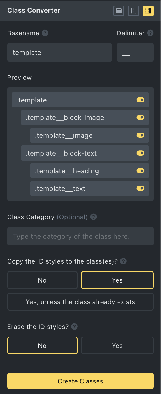
Class Converter
The aim of the Class Converter is to remove the classes at the ID level and bring them to the parent level as this is good practice.
By clicking on the Class Converter option a modal will show, either as a left sidebar, a right sidebar (as seen here), or as a full-screen modal.
With the Converter, we can create classes on the selected element and all its children in just a few clicks! The class name will be autogenerated using the label of each element.
The way it works is as follows: Fill in the Parents Basename (in this case ‘template’), followed by a ‘Delimiter’ of choice or following BEM conventions (double ‘underscore’).
Now, all the children will have the parents name with the delimiter followed by their own meaningful element name.
So, from now on the naming no longer has to be done manually one-by-one, but will happen automatically.
You can also assign all the newly renamed classes to a Class Category, in order to group them.
Furthermore, you can decide to copy the ID styles to those classes, and whether you want to delete those copied ID styles.
If you decide to delete the ID styles, then all styles on the ID level are gone, and in the Style Panel (on the left), you’ll find the new classes per element.
And when you open the Class Manager, you’ll find your new classes, grouped in their category.
It will also work with the Component Class Manager.
Tip: If you want to change the name of an element to a more meaningful name, you can use your RETURN key to erase the name and type the new name. Then use TAB to go to the next element and do the same.
NB. As per v2.0.4. you can manually make changes per element, as well as skip changes per individual elements with the yellow ‘skip’ button. Once you use this button, the red lock will appear again, meaning this element has no class.
This YouTube video, made by Aperture Digital Marketing, shows exactly how to convert all ID styling to Classes.

Style Overview
Accessible from any element through the structural panel’s context menu, this tool enhances the ability to easily review all active styles linked to the current element’s ID, as well as its corresponding classes across all breakpoints and pseudo-elements.
It is not only a visual overview, this tool also allows for many other effective functions; from changing any value within the table to easily opening the appropriate style panel by a click on the CSS properties.
It also lets you set your custom values that do not fall within the Bricks dropdown options.
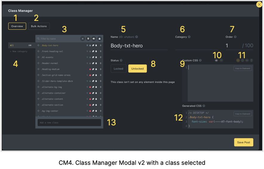
Component Class Manager
Bovenstaande header is een link naar de pagina Classmanager.