14 AT-Color Manager (v2.0.4)

Installation
After installation of version 2.0 the AT-Color Palettes menu item has disappeared from the Bricks dashboard menu, as well as from the admin top bar.
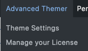

In order to find the color palettes again, we’ll have to go into the Theme settings, and then into Global settings.
Now, enable the Global Colors setting below and see a new tab appear in the horizontal top menu.
To keep the colors you defined previously it is very important to switch this on as the variables will be recalculated, keeping your colors the way they were.

And this is what we’ll find inside the Global Colors Tab.
1: A brief explanation of CSS variables,
2: the possibility of adding a prefix to your color variables,
3: enabling Dark Mode on the frontend, and
4: to set a Global Meta Theme Color.
The significance of setting a Global Meta Theme Color can be found by following this link https://developer.mozilla.org/en-US/docs/Web/HTML/Element/meta/name/theme-color.
After you’ve clicked the SAVE button, go to the Bricks workspace where you’ll find a new icon at the right top bar, above the Structure Panel.

Eager to click the button (ctrl-cmd-m)? Let’s do it, and we’ll see the next screenshot with a color overview from the default palette.

Overview
Underneath the label ‘Color Manager’, we’ll see a field with a ‘sun’ icon (1) and the name ‘Default’, which is the name of the present standard Bricks color palette. When hovering over this field a group of new icons appear.
See “Explanation of Icons” below.

Explanation of icons
1 Toggle Darkmode or Lightmode
2 Dropdown with different palettes to choose from
3 Set a palette as the default
4 Rename the palette
5 Add a new palette
6 Duplicate this palette
7 Delete this palette
8 Filter by color name
CSS variables
The colors in AT are based on CSS variables whereas the colors in Bricks have static values. One benefit of using CSS variables is that when a change is made to a color (a different shade for instance) it will be applied across the whole site wherever this color is used. Another benefit is that the colors can be more easily manipulated as shades and that the use of CSS variables is more dynamic.

Convert Bricks colors
You may have noticed that the standard Bricks colors look muted (fig. 6). Now when you hover over one of the Bricks’ standard static value colors, you’ll see two arrows at the end, giving the possibility to convert them to CSS variables.
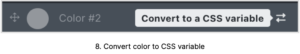
And once you’ve done so, the following change has taken place which you will see when you hover over the color. The color has become more vibrant and a bunch of new icons have appeared, the meaning of which you can find below.
Changes as per version 2.04
BTW as per version 2.04 when a color is assigned to an element on this page it will show with a mark. Another improvement is that a color can be dragged to a different position (see the drag handle in front of the color).
By clicking once on more than one drag handle you select multiple colors and drag them all at once into a new position.
The icons in the darkmode button and toggle elements are now changeable. Before they were hardcoded.

Meaning of icons
1 Rename
2 Generate shades
3 Duplicate
4 Copy to clipboard
5 Delete

Generate shades
Let’s generate some shades by clicking on icon #2.

The next windows will show:
1. The Base Name which can be adjusted,
2. The number of preferred shades,
3. The color scale.
4. Click on the color and a color picker appears. Here you choose the ENDPOINT of your scales,
5. Which will be reflected in the preview,
6. Clicking the button will generate the shades.
Of course, the shades can be re-ordered, renamed, and re-done.
Transparent shades
The same technique can be applied to create transparent shades, and instead of choosing a different end color, we keep the same color (4) and use the transparency slider inside the color picker to create a transparent endpoint.

Multiple colors shades
But, it can become even more sophisticated by using multiple colors. Have a look at the next screenshot with 4 different colors.
Yellow is still the starting point, and by using the ‘+’ sign in the color scale we added two more colors compared to fig. 12. We increased the number of shades to 20 and the result is shown in the preview on the right.
When you want the colors in a different order you can drag and drop the colors in any order you want.

Delete a color
Delete any of the colors by hovering over it and it will show a ‘delete’ sign.

Colorpicker
The color picker is quite sophisticated, as by clicking on the double arrow you can change from HEX to RGB to HSL, and use transparency for each as well.


Dark mode
Let us create a new palette – test palette-, and create a new background color. Type in the name of the new color, press return, and there it is.
When we go into Settings (cog wheel left side top bar) – Theme Styles – General – Site background and click the color icon, we choose the new background color we created earlier.
When opening we now see by the checkmark, that the color is assigned and active on the page. When we click on the color and start manipulating it we see the background of the page/site changes as well.
Now, click on the Dark/Light mode button and the background turns totally black. This color however can be adjusted to your liking by clicking it and manipulating it into the desired color in the color picker, or assigning color values manually.


We can do the same for the elements. Let’s create a color for a header and body text, and by clicking the element select the style and in typography assign the new colors.
When you look at your page the background is black and so the elements have disappeared as they are black as well.
Going back to the color manager, click on the color for the header and drag the color picker to the desired color. Do the same for the body text.
From now on, you can switch between Dark and Light mode with a simple click, especially when you use the two new elements that AT has added.