6 Builder Tweaks
Header
The Bricks Builder has a couple of small hiccups AT aims to smooth out for a better experience. For example, wouldn’t it be nice to choose the hover state of an element with fewer clicks? How about easily identifying overflowing elements on mobile devices? Or perhaps, quickly verifying if an element meets the contrast requirements for accessibility standards? With these little improvements, your journey in Bricks building will become even more delightful!
In this chapter, you’ll find a number of options for boosting productivity inside the Bricks builder. Helpful links: Official website
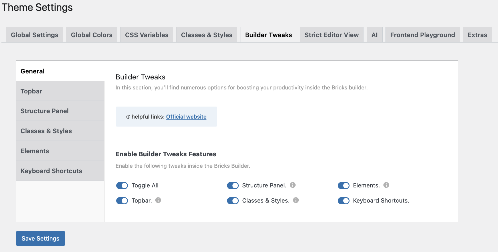
Builder Tweaks: General
Enabling the panels will create new features and icons in the workspace of Bricks, and will enhance productivity in the Topbar, Structure Panel, Classes & Styles, and Elements.
We will discuss each one below.
Builder Tweaks - Topbar
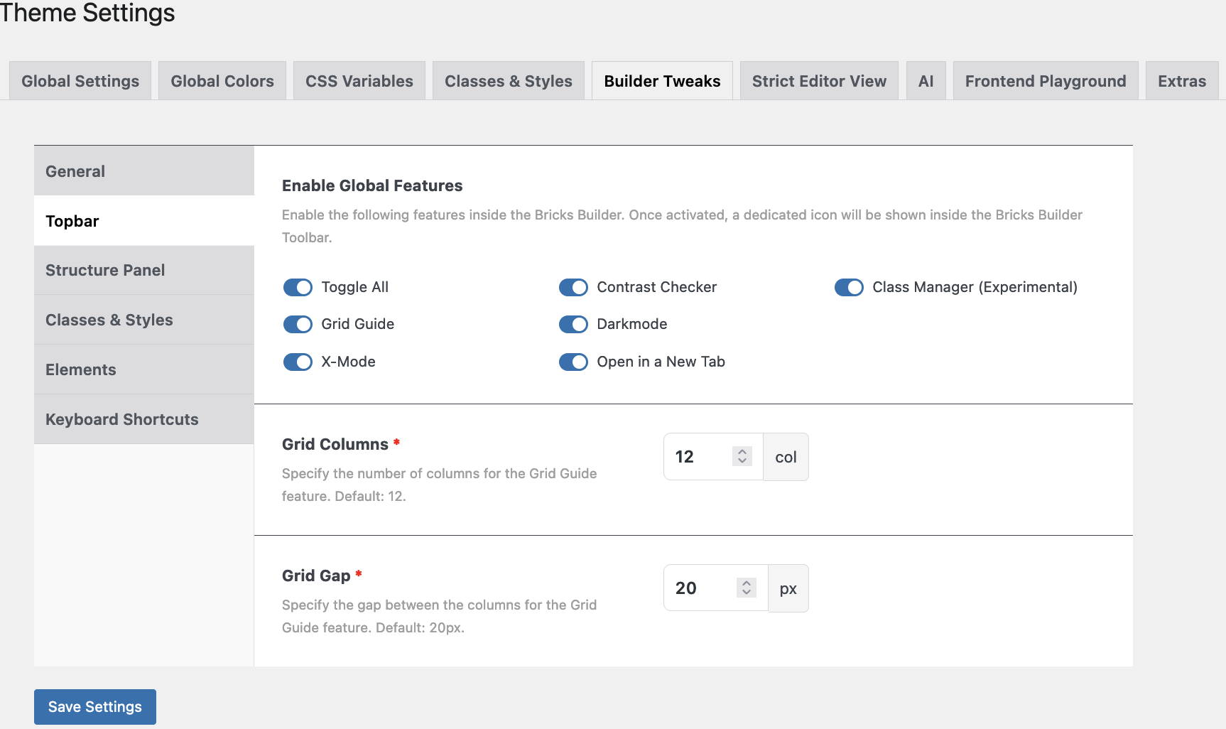
Enable Global Features
Enabling the different features inside the Bricks Builder will show additional dedicated icons. See the “Top Bar” ‘comparison’ below.
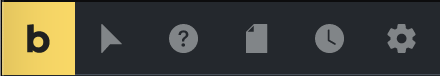
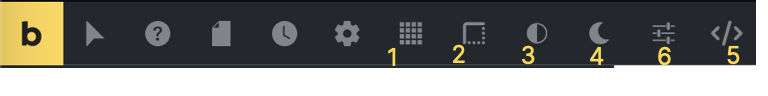
Header
The ‘normal’ Left Top Bar in Bricks, and below the “Enhanced” Left Top Bar with 6 additional icons.
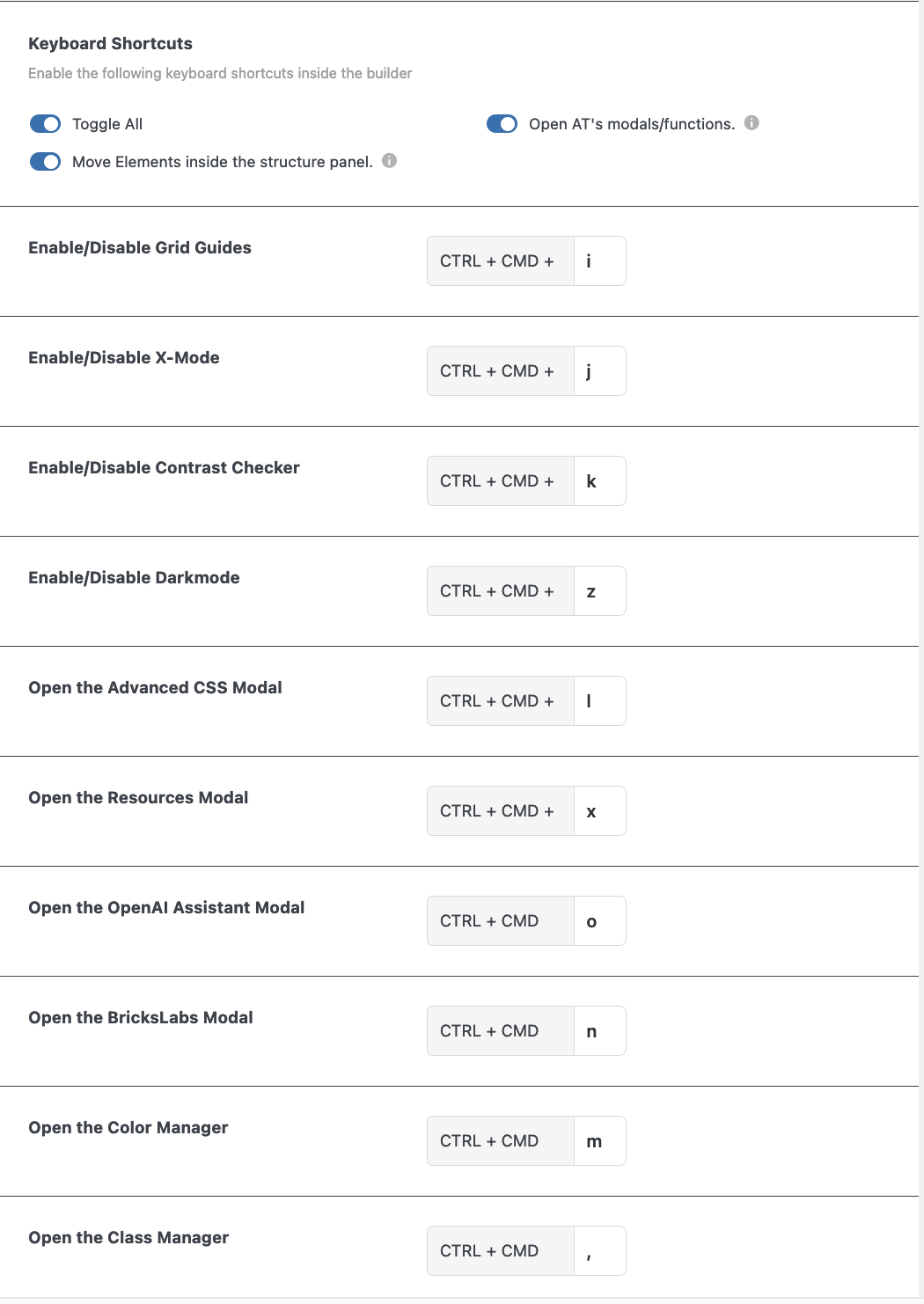
1: Grid guides, 2: X-mode, 3: Contrast Checker, 4: Darkmode, 5: Advanced CSS, 6: Class Manager. More info below.
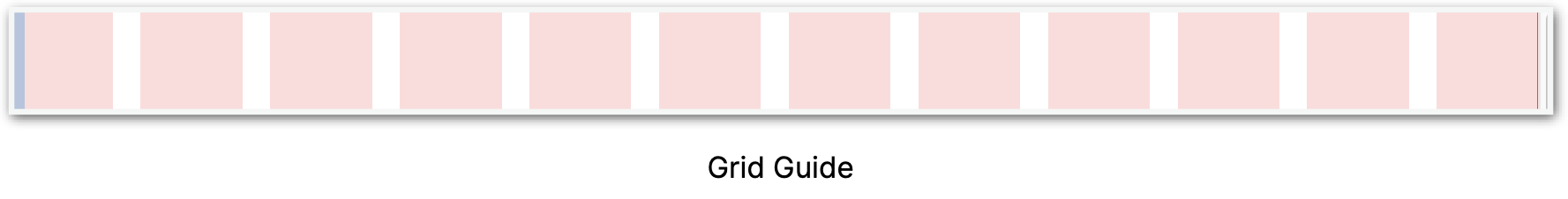
1 Grid guides
When you click this icon the whole screen shows the grid guide, which can be used for design purposes.
2 X-mode
Choosing x-mode changes the site into wireframe mode. This can come in handy for finding overflows on pages.
3 Contrast Checker
Choosing x-mode changes the site into wireframe mode. This can come in handy for finding overflows on pages.
4 Darkmode
On/off
5 Advanced CSS
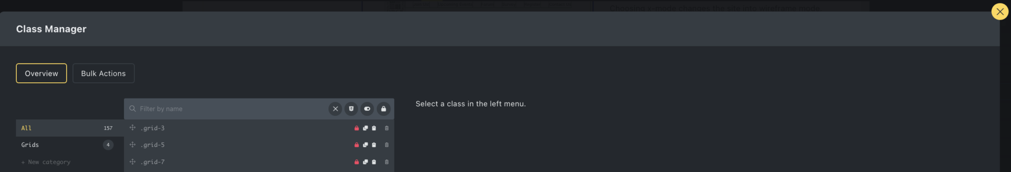
6 Class Manager
Would you like to know more about the Class Manager?
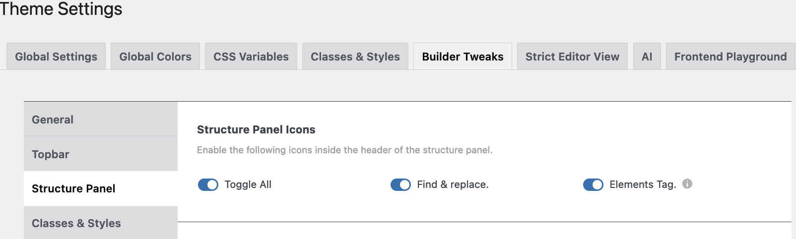
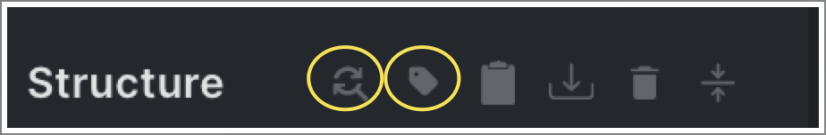
Builder Tweaks - Structure Panel Bar
Two new icons will show in Bricks Builder’s Structure Panel Bar.
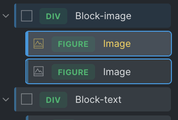
The icons are “Find & replace”, and show “Elements Tag”.
When the latter is activated the HTML tag of each element will be shown inside the structure.

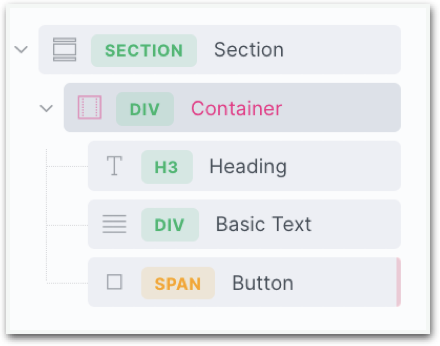
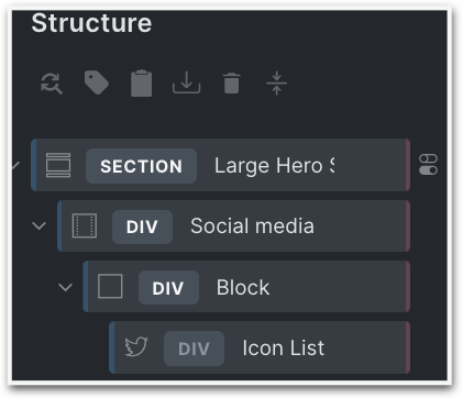
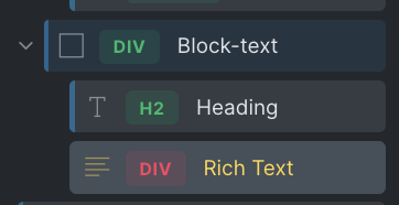
Default Tag View
Default Tag View has a dropdown menu. The choice will change/enhance the Structure Panel in Bricks Builder.
In Developer Mode – With colors and drop-downs the structure panel will change into the screenshot below left.
Overview Mode – No colors see screenshot below right.
The red indicator (very faint) on the right side of the element means that there is some styling done at ID-level. The blue bar on the left side (also faint) indicates that at least one global class has been created.
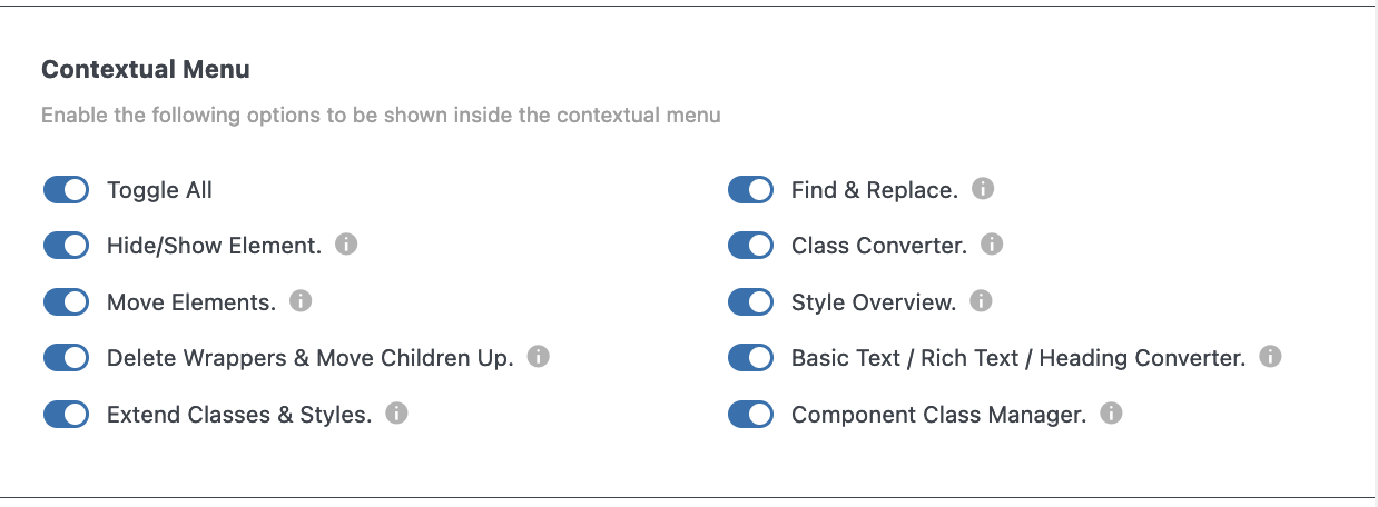
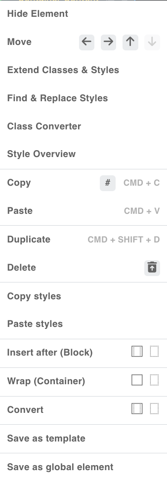
Contextual Menu
When the buttons are activated the following functions are added to the contextual menu (right mouse click) in the structure panel, however you can also go to a dedicated page about The Contextual Menu.
Hide Element: The element will be set by Bricks as display: none. Click the hidden ‘eye’ next to the element to ‘undo’ or right-click the context menu on ‘Show Element’,
Move Elements: A new contextual item will show up with 4 different arrow icons to move the element inside the structure panel,
Extend Classes & Styles: A modal will show to let you extend the classes & styles of the selected element to other elements.
Find & Replace Styles: through a modal, you can replace any style value on the chosen element.
Class Converter: through a modal, you can automatically convert the ID styles of an element (and its children) to an autogenerated class.
Style Overview: Accessible from any element through the structural panel’s context menu, this tool enhances the ability to easily review all active styles linked to the current element’s ID, as well as its corresponding classes across all breakpoints and pseudo-elements. This tool allows you other effective functions as well; from changing any value within the table to easily opening the appropriate style panel by a click on the CSS properties. It also lets you set your own custom values. Click here for Maxime’s video
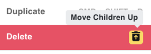
Delete Wrappers & Move Children Up: a new item will show up in the ‘Delete’ item menu, with which you can delete the parent item and move all child elements up.
The other functions speak for themselves and don’t need further explanation.
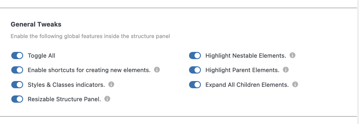
General Tweaks
Enable Shortcuts …: This creates a right 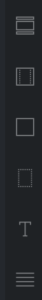 sidebar inside the structure panel with shortcuts to the most used elements ,
New vertical bar indicators at the element level. The left bar (blue) indicates at least one global class has been applied. The right bar (pink) indicates it contains styles at ID-level (see earlier screenshots at Default Tag View).
Resizable Structure Panel: You can resize the structure panel to any width you like,
Highlight Nestable Elements: The icon of the nestable elements will be highlighted with a blue color,
Highlight Parent Element: When I choose the Heading element, the background of (all) the parent element(s) will be highlighted with a blue color. Useful when having very complex constructions.
Expand All Children Elements: With thisenabled there is a new icon to the right side of a parent element with which you can expand all children elements, but only for this specific parent. Not for other parent elements.
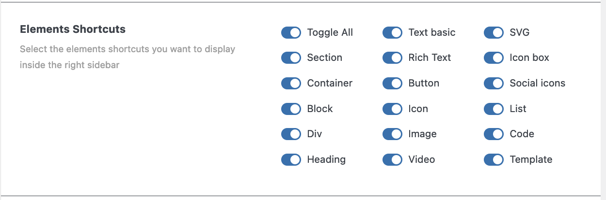
Element Shortcuts
This panel let you decide which elements you want to show in the right vertical bar.
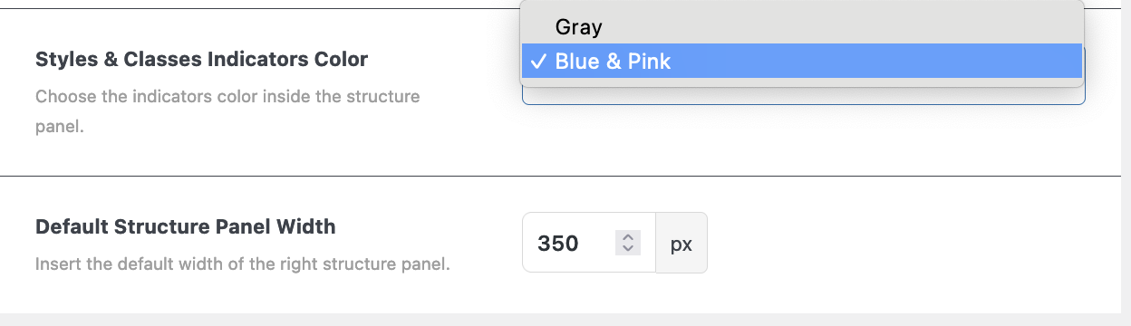
Styles & Classes Indicator Color
Here you can choose between either colored or grey indicators inside the structure panel.
Default Structure Panel Width
And you can decide how wide you prefer to have your structure panel.
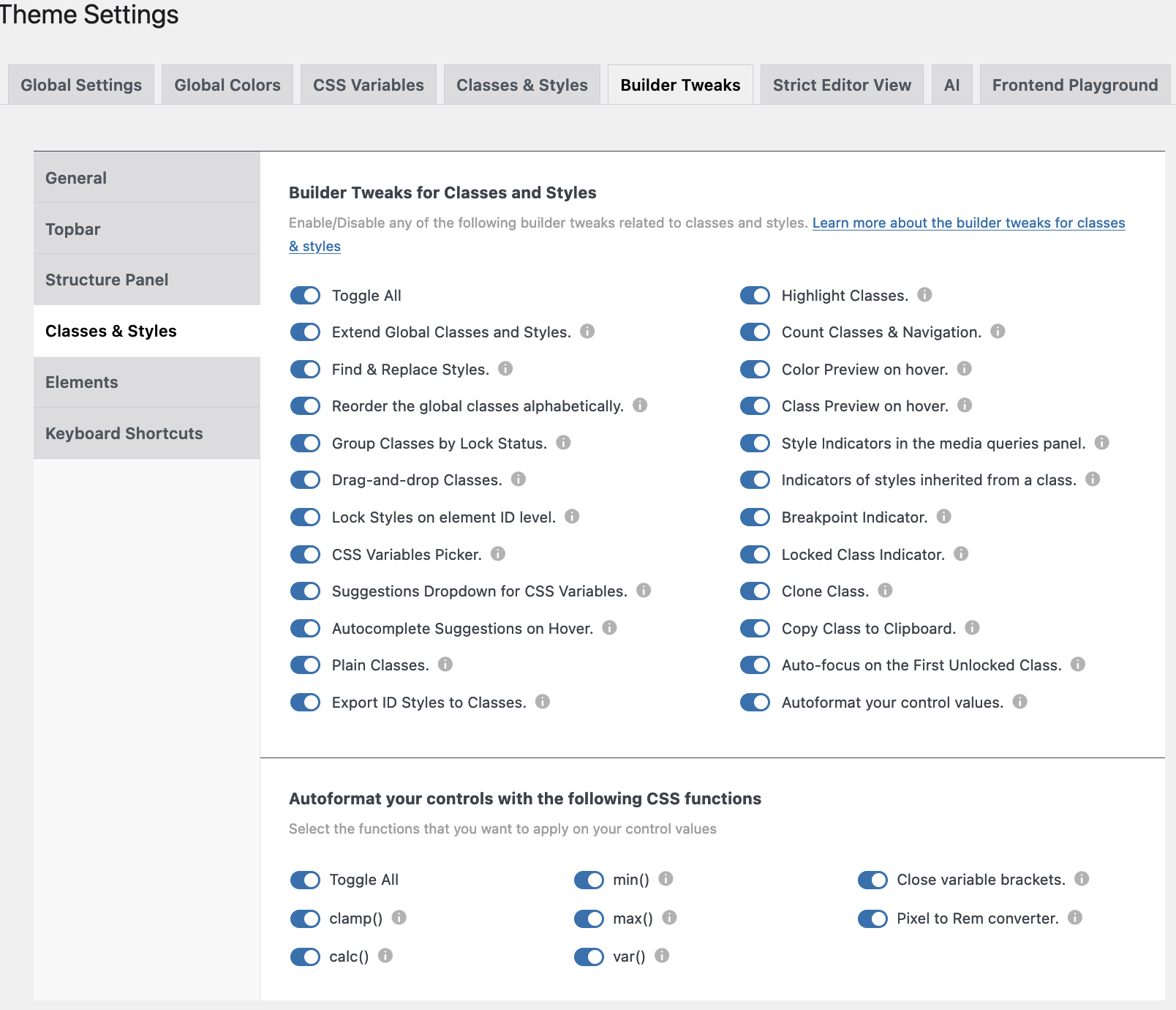
Builder Tweaks - Classes and Styles
Enable/Disable any of the following builder tweaks related to classes and styles.
Learn more about the builder tweaks for classes & styles.
- Extend Global Classes & Styles. You can extend a class from an element to either parent and/or child elements.
- Find & Replace Styles. You can find and replace any class/style assigned to one element to other elements in the builder.
- Reorder the Global Classes alphabetically. Check this option if you want your global classes ordered alphabetically in the builder.
- Group Classes by Lock status. You can reorder your classes by lock/unlock status.
- Drag & Drop Classes. You can reorder the classes of an element by drag & drop.
- Lock Styles on element ID level. Enable this one when you don’t want to style your elements at the ID level. To unlock just click the lock icon.
- CSS variables picker. When this one is enabled, you’ll see a little ‘v’ in relevant fields. When you click on it a modal will open from which you can choose the relevant CSS variable.
- Suggestions dropwdown for CSS vairables. A bottom popup will show with suggestions for CSS variables.
- Autocomplete suggestions on Hover. When you hover over a CSS variable it will be applied to the field.
- Plain Classes. When checked a new icon will appear next to the element’s class field. When clicked a popup appears where classes can be added/removed (in bulk).
- Export ID styles to Classes. A new icon will appear next to the elements class field. You’ll be able to insert a class name and export all your ID styles to it.
- Highlight Classes. A blue outline will appear around all elements that share the same class, when clicked on it.
- Count Classes & Navigation. A new counter will show next to the class name, showing how many times the class has been used. A click on it will scroll the page to all elements with that class.
- Color preview on Hover. Hovering over a color will apply that color to an element. Nice to preview the effect.
- Class preview on Hover. This will do the same as the previous Color preview, this time with the effect of different classes.
- Style indicators in the Media Queries panel. Whenever you apply a class or style at a certain media breakpoint, a yellow bar will appear underneath.
- Indicators of Styles inherited from a class. You’ll see a blue dot on the left of the controls that have a style generated from an active class.
- Breakpoint indicator. Inside the Style tab you’ll see a small device icon of each breakpoint where a style or class is applied.
- Locked class indicator. A red background will appear when an element is locked. The unlocked ones will have a green background.
- Clone class. A new clone icon will show up once you activate a class. Once clicked, an input field will be visible with the name of the original class, change the name and a new class with all styles of the original one will be saved.
- Copy class to Clipboard. A new clone window will show once a class is activated. A click on the icon will copy the class to the clipboard.
- Autofocus on the first unlocked class. The first unlocked class of the selected element will be enabled instead of the ID style level.
- Autoformat control values. AT will autoformat your control values with functions like: var(), calc(), clamp(), min(), max(), and px to REM converter.
Autocomplete for CSS variables
As of version 1.1. when you select an element and you go to the Style Panel, e.g. Layout—> Width and you either put a value in one of the fields or click on the ‘v’ icon for “Select CSS variable”, whenever you hover over one of the values the changes are immediately visible in the work area. This is also true when experimenting with colors (RAW).
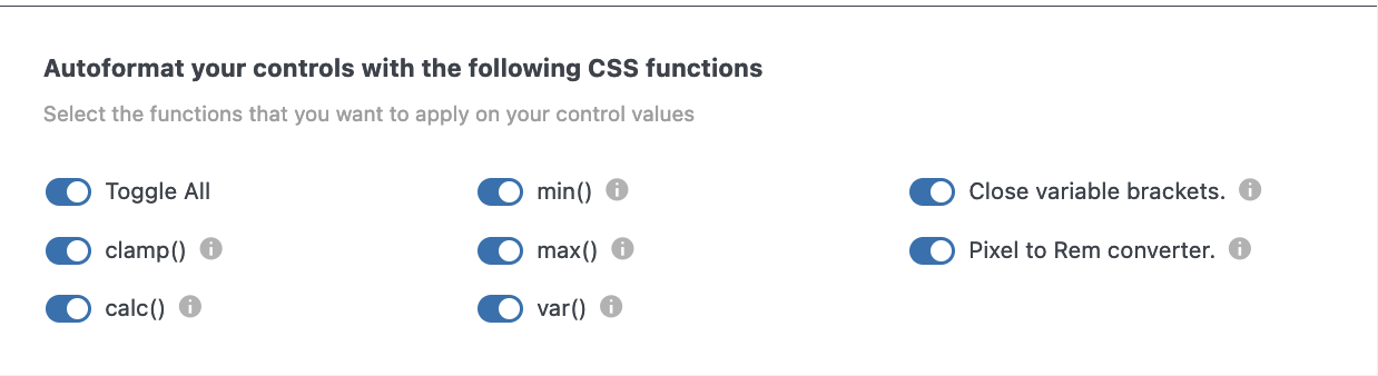
Autoformat your control values
When Autoformat is enabled (version 1.2.4.1) the screen on the left becomes visible.
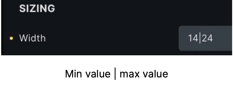
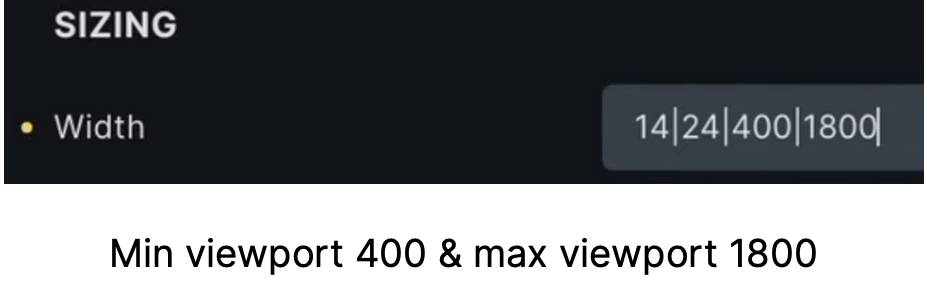
Clamp calculation: e.g. clamp calculation in width will happen automatically when using a minimum value separated by a pipe symbol ‘|’ and a maximum value. You have to give values in pixels, and AT will convert it into rem. However, you can also define alternative viewports as in the images on the left.
Add another pipe symbol and the smallest viewport (400), another ‘pipe’, and then the maximum viewport.
When Autoformat is enabled (version 1.2.4.1) the screen on the left becomes visible.
Clamp calculation: e.g. clamp calculation in width will happen automatically when using a minimum value separated by a pipe symbol ‘|’ and a maximum value. You have to give values in pixels, and AT will convert it into rem. However, you can also define alternative viewports as in the images on the left.
Add another pipe symbol and the smallest viewport (400), another ‘pipe’, and then the maximum viewport.
Calc() function
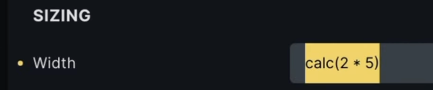
Calc () function: supports the ‘+’, ‘–‘, ‘*’, and ‘/‘.
Min() function
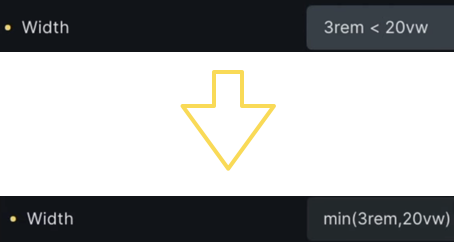
Min function: input “3rem < 20vw” automatically shows the lower image.
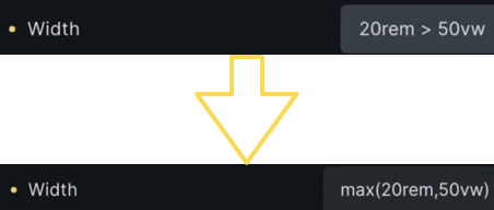
Max() function
Max function: input 3rem > 50vw shows automatically shot below
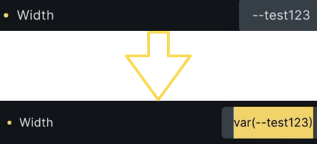
Var() function
Var (): Starting with a double hyphen type the name of your variable and it will be translated into a var.
Close variable brackets: If for some reason you forget to put the closing bracket, AT will now add that one.
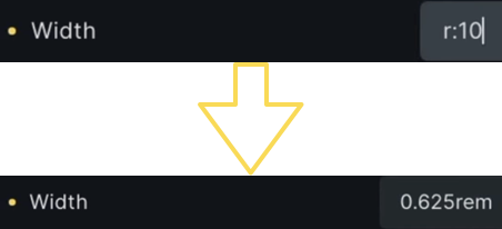
PX to REM converter
Pixel to Rem Converter: When you type r:10 it will automatically be converted to Rem.
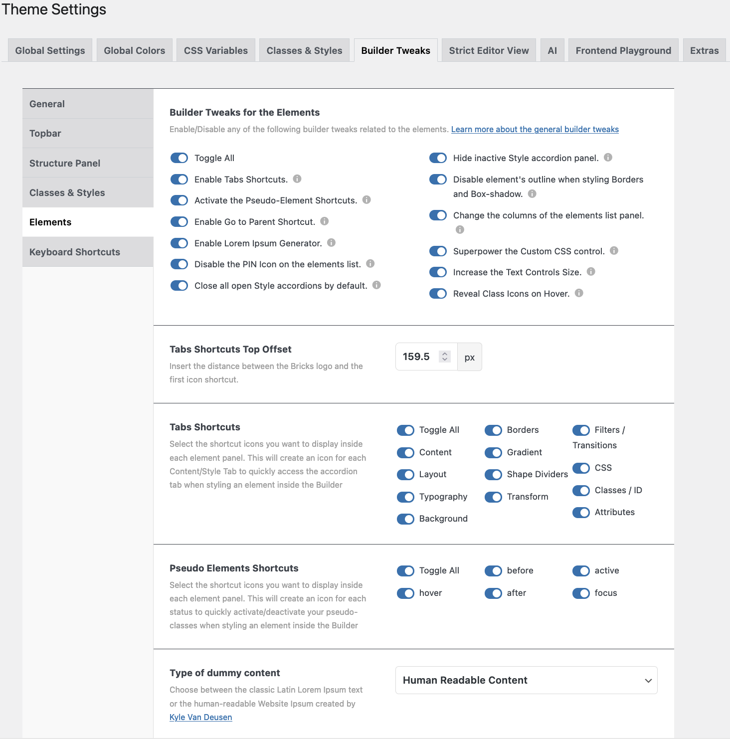
Builder Tweaks for the Elements Overview
There is a lot to cover in this part of the Builder Tweaks. Here you can enable or disable any of the builder tweaks related to the several elements.
Learn more about the general builder tweaks.
Let’s go through it step by step.
Elements details
- Toggle all. Or toggle a few.
- Enable Tabs Shortcuts. This will create a vertical bar on the left side of the Elements and Style Panel.
- Activate the Pseudo-Elements Shortcuts. New icons will appear next to the ‘Conditions’ and ‘Interaction’ icons. They are ‘:hover’, ‘:before’, ‘:after’, ‘:active’, and ‘:focus’.
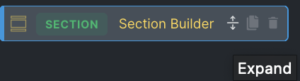
- Enable ‘Go to Parent’ Shortcut. A new icon will show up at the far right
 side of the above mentioned icon line.
 - Enable Lorem Ipsum Generator. In every relevant text field you will have the choice to use the text generator, either “Lorem Ipsum” or “Human Readable Text”.
- Disable the Pin Icon on the Elements List. Enabling this will hide the Pin icon.
- Close all open Style Accordions by default. All tabs will be closed by default, so you don’t have to close them repeatedly when styling an element.
- Hide inactive Style Accordion. All inactive Style Accordions will be closed by default, only the one you are working in will be shown.
- Disable the Elements Outline when styling the Border or Box Shadow. When working on an element the outline will be gone.
- Change the columns of the Elements List Panel (1, 2, 3, or 4 columns).
 When enabled, you’ll see 3 new icons appear at the top of the Elements Panel.
 - Superpower the Custom CSS control. When enabled the Custom CSS Controls will have new functionalities like: match brackets, auto-indent, search function, autocomplete css-variables, etcetera.
- Increase the Text Controls Size. When this one is enabled the text control fields will be 30% – 50% larger in order to write the longer CSS-variables.
- Reveal Class icons on Hover. The icons inside the Class input field are hidden, and become only visible when hovered over.
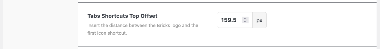
Tabs Shortcuts Offset
With this feature, you can change the distance between the Bricks Logo and the shortcut icons on the left-hand side of the Elements panel.
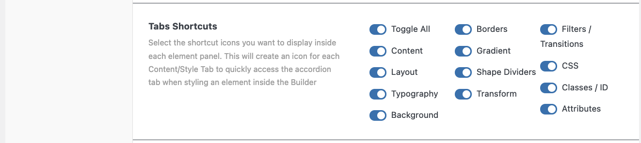
Tabs Shortcuts
Select the shortcut icons you want to display on  the left side of the Elements Panel.
This will create an icon for each Content/Style Tab in order to quickly access the accordion tab when styling an element inside the Builder.
In order to see the icons you have to select a class or ‘unlock’ an element.

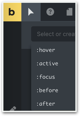
Pseudo Elements Shortcuts
With AT two more pseudo-elements are added.
Select the shortcut icons you want to display inside each element panel. This will create an icon for each status in order to quickly activate/deactivate your pseudo-classes when styling an element inside the Builder.
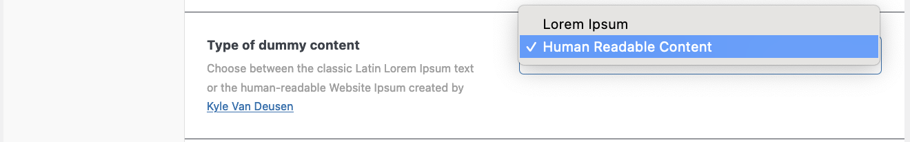
Type of Dummy content
From now on you can choose between the classic Latin “Lorem Ipsus” text or the human-readable “Website Ipsum” created by Kyle Van Deusen.
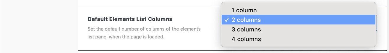
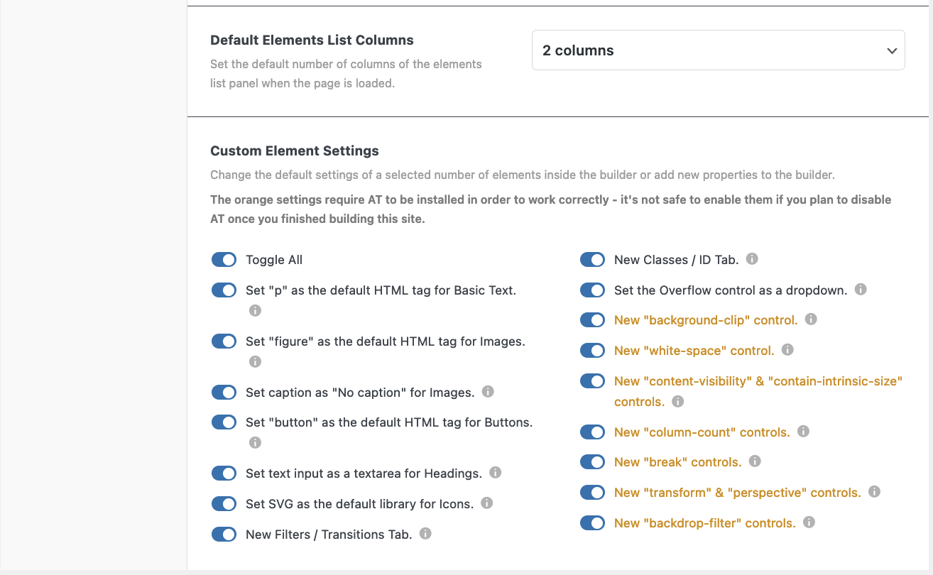
Default Elements List Columns
Set the default number of columns of the elements list panel when the page is loaded.
Choose between a two, three, or four-column layout for your elements.
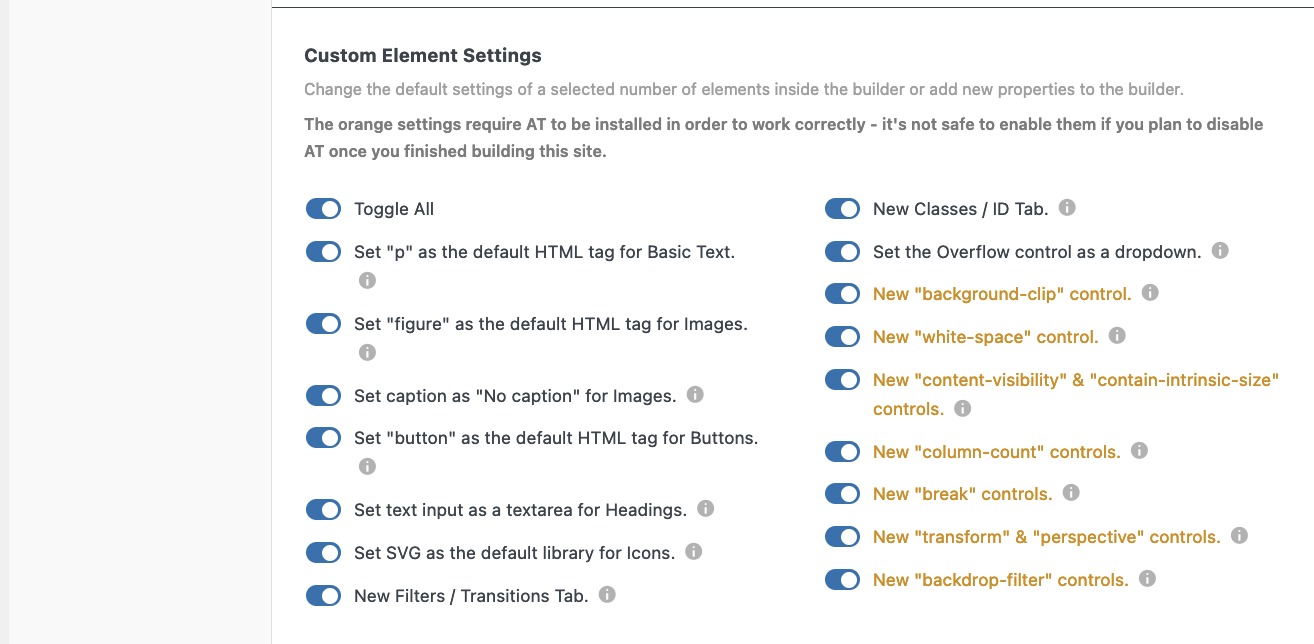
Custom Element Settings
With this part you can change the default settings of a selected number of elements inside the builder or add new properties to the builder.
WARNING! The orange settings require AT to be installed in order to work correctly – it’s not safe to enable them if you plan to disable AT once you finished building this site.
- Toggle All
- Set “p” as the default HTML tag for Basic Text.
- Set “figure” as the default HTML tag for Images.
- Set caption as “No caption” for Images.
- Set “button” as the default HTML tag for Buttons.
- Set text input as a textarea for Headings.
- Set SVG as the default library for Icons.
- New Filters / Transitions Tab. In
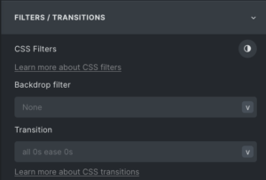 the Style Panel is now a new tab. It is also available as a new shortcut in the left vertical bar.
 - New Classes / ID Tab. This is a new tab as well and the content could previously be found in the CSS tab. This one is also available as a shortcut.
- New “background-clip” control. Can be found in the Style Panel – Background. The next 4 items are in the Style Panel – Layout – Misc, however, not all browsers support these:
- New “white-space” control.
- New “content-visibility” &
- New “contain-intrinsic-size” controls.
- New “column-count” controls. When you select a container/block and select ‘block’ you can now change the number of columns without using flex or grid.
- New “break” controls.
- New “transform” & “perspective”
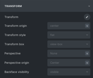 controls. In Style Panel – Transform are a number of new advanced functionalities to be found.
 - New “backdrop-filter” controls.
NB. The Overflow function has a number of 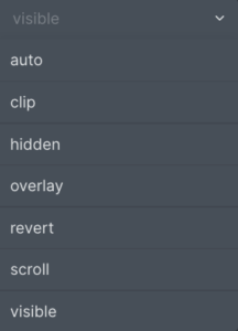 added functionalities as well.