
4 Theme Settings – CSS Variables
This chapter is about CSS variables, one of the most important features of Advanced Themer.
All responsive design of a site is based on the fluidity of using variables for spacing, width, typography, colors, etcetera.
By toggling on/of you can decide which variables you want to work with.
CSS Variables
Bricks responsive settings are mainly based on CSS media queries. That means that you essentially need to style each element several times based on the device width. What if you could add a unique style to your element, and it would adjust automatically on all devices? That’s exactly the purpose of the Fluid variables introduced in Advanced Themer.
This is the central place to manage all CSS variables easily thanks to the in-built CSS Variables GUI. Now we can create fluid and responsive typography, spacing, border, and width scales in just a few clicks!
More information can be found on the Official website. Let’s dive in…
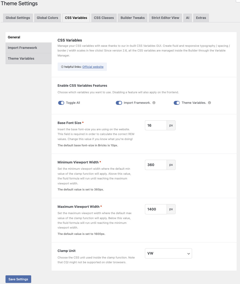
Theme Settings: Enable CSS Variables Features
Left is the full overview of the CSS variables screen. We’ll go over it one by one. This is the screen where you can choose which variables you want to use. Enabling/disabling a feature here will also enable/disable the same feature on the front end.

Once the CSS variables are enabled some changes happen in the workspace. Have a look at the screenshot of the Element ‘Style’ panel in Bricks.
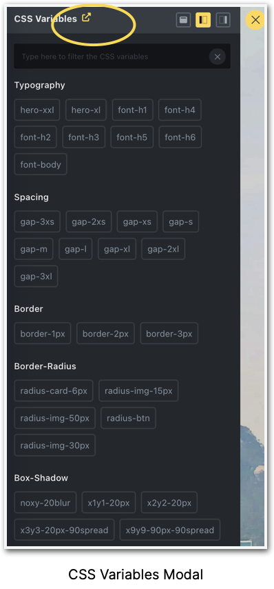
Wherever you see the ‘v’ means that you can use variables. When you click on the ‘v’, the screen beneath it will open with a number of pre-defined variables as well as your own hand-made variables.
In the top right corner, you can choose between appearance as a left sidebar (as pictured), as a right sidebar, or as a screen-wide modal. The ‘close’ button is at the top right.
A number of variables come with the purchase, but most of them you have to create yourself.

Add a prefix to your global CSS variables
Creating a prefix will be automatically added to all CSS variables. Example of a variable generated with “LJ” as prefix: —LJ-gap-1.
Why is that relevant?
Well, many Bricks users also work with an (S)CSS framework. The naming convention could be overlapping and confusing, and by putting your own prefix (e.g. AT or your own initials) before your variables you will always recognize the ones you made.

Base Font Size
Insert the base font size you are using on the website. This field is required in order to calculate the correct REM values. Change this value only if you know what you’re doing! The default base font size in Bricks is 10px.

Minimum Viewport Width
Set the minimum viewport width where the default min value of the clamp function will apply. Above this value, the fluid formula will run until reaching the maximum viewport width. The default value is set to 360px.

Maximum Viewport Width
Set the maximum viewport width where the default max value of the clamp function will apply. Below this value, the fluid formula will run until reaching the minimum viewport width. The default value is set to 1600px.

Clamp Unit
Choose the CSS unit used inside the clamp function. Note that CQI might not be supported on older browsers.

Theme Settings: Typography
In the screenshot, you can see how you can add, edit, or remove typography variables. Each row requires a label, a min value, and a max value. The label is used to create the CSS variable like var(—label).
The min value “1” is set in pixels and represents the default value applied when reaching the minimum viewport width set in the Settings tab.
The max value “2” is also set in pixels and represents the default max value when reaching the maximum viewport width.
Keep in mind that all pixel values will be converted into REM on the front end.
As we saw in the chapter about Colors, there is a number (see “3”) in front of each row, meaning you can reorder the different fonts if necessary. The number will change accordingly. At the end of each row are the “+” and “-“ buttons to duplicate or delete a row.
Each font is based on a variable and when they interfere with another framework you can easily delete them. The CSS footprint however is very small.
The plugin comes with a variety from “H1” to “H6”, “font subtitles”, and “body”.
You can add as many font sizes as you like, creating your own global styles.
The default values are set according to the Utopia’s fluid type scale calculator.

Theme Settings: Spacing
Spacing Variables
In the screenshot below you can see how you can add, edit, and remove the spacing variables. Each row requires a label (1), a min value (2), and a max value (3). The label is used to create the CSS variable like var(–label). The min value is set in pixels and represents the default value applied when reaching the minimum viewport width set in the Setting tab. The max value is also set in pixels and represents the default max value when reaching the maximum viewport width.
Keep in mind that all the pixel values will be converted into REM on the front end.
As we saw with the color shades there is a number (see “4”) in front of each row, meaning you can reorder the different fonts if necessary. The number will change accordingly. At the end of each row are the “+” and “-“ buttons to duplicate or delete a row.
The default values are set according to the Utopia’s fluid space calculator.

Theme Settings: Borders
In the screenshot you can see how to add, edit, and/or remove border variables. Each row requires a label and a value. The label is used to create your CSS variable like var(–label). The value needs to be a proper CSS border value (example: 1px solid #000000).


Theme Settings: Border Radius
Border-Radius Variables
You can add, edit, and/or remove the border-radius variables here. Each row requires a label (1), a min value (2), and a max value (3). The label is used to create your CSS variable like var(–label). The min value is set in pixels and represents the default value applied when reaching the minimum viewport width set in the Setting tab. The max value is also set in pixels and represents the default max value when reaching the maximum viewport width.
Keep in mind that all the pixel values will be converted into CQI/REM on the front end.
As we saw before there is a number (see “4”) in front of each row, meaning you can reorder the different fonts if necessary. The number will change accordingly. At the end of each row are the “+” and “-“ buttons to duplicate or delete a row.
When I add a new radius circle, I give it a label, minimum value, and max value, and voila. See the result below:

Theme Settings: Box-Shadow
In the screenshot, you can see how to add, edit, and/or remove box-shadow variables. Each row requires a label and a value. The label is used to create a CSS variable like var(–label). The value needs to be a proper CSS box-shadow value (example: 0px 20px 40px #000).

Theme Settings: Width
In the screenshot, you can see how to add, edit, and/or remove Width variables. Each row requires a label, a min value, and a max value. The label is used to create your CSS variable like var(–label). The min value is set in pixels and represents the default value applied when reaching the minimum viewport width set in the Setting tab. The max value is also set in Pixels and represents the default max value when reaching the maximum viewport width.
Keep in mind that all the pixel values will be converted in CQI/REM on the front end.

Theme Settings: Custom Variables
With Advanced Themer, you’re free to explore beyond fixed variable categories. Go ahead and create your own variables, for any existing CSS property – be it with static or fluid values. Have fun as Advanced Themer comes up with a custom clamp function tailored for all your fluid variables!
You can create, edit or delete your own custom variables here, instead of going into the ‘root’ and doing your own custom CSS. Here is the place to make it happen.
First, create a category where the variable will be stored. The category label will be shown inside the Variable Picker. Each row requires a label and a value.
The label is used to create your CSS variable like var(–label). Choose between a static (1) or a fluid (2) (clamp) variable.
As mentioned previously there is a number in front of each row, meaning you can reorder the different variables if necessary. The number will change accordingly. At the end of each row are the “+” and “-“ buttons to duplicate or delete a row.
Import your own CSS Variable Framework
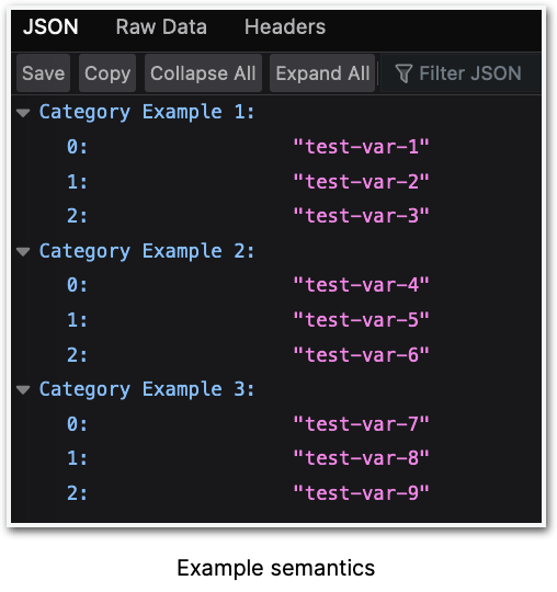
In this section, you can upload your own CSS Variable Framework. To do so, just set a label and select the JSON file that contains your categories and variable values. In order to work correctly, you need to follow the same semantics as in this example (see screenshot below). If you’re not allowed to upload JSON files to the Media Library, go to the Settings tab -> Permissions -> toggle on the JSON option.