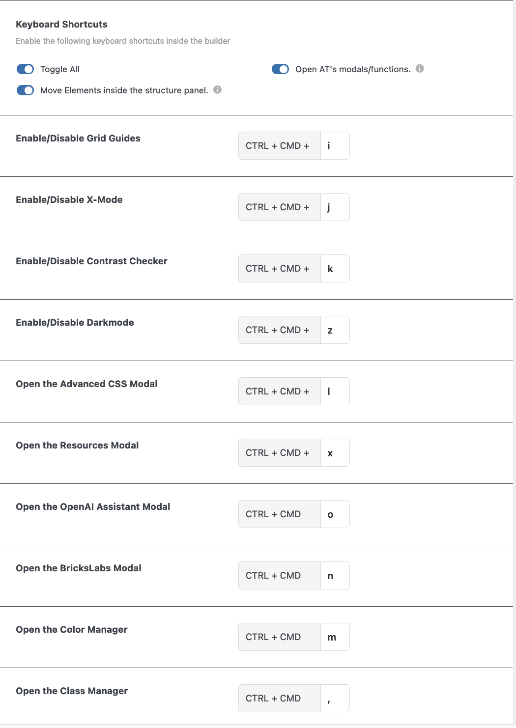
8 Builder Tweaks for the Elements
Overview
There is a lot to cover in this part of the Builder Tweaks. Here you can enable or disable any of the builder tweaks related to the several elements.
Learn more about the general builder tweaks.
Let’s go through it step by step.
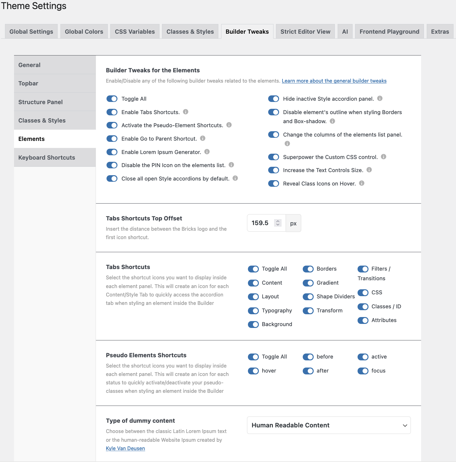
Elements details
- Toggle all. Or toggle a few.
- Enable Tabs Shortcuts. This will create a vertical bar on the left side of the Elements and Style Panel.
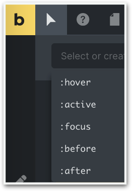
- Activate the Pseudo-Elements Shortcuts. New icons will appear next to the ‘Conditions’ and ‘Interaction’ icons. They are ‘:hover’, ‘:before’, ‘:after’, ‘:active’, and ‘:focus’.
- Enable ‘Go to Parent’ Shortcut. A new icon will show up at the far right
 side of the above mentioned icon line.
 - Enable Lorem Ipsum Generator. In every relevant text field you will have the choice to use the text generator, either “Lorem Ipsum” or “Human Readable Text”.
- Disable the Pin Icon on the Elements List. Enabling this will hide the Pin icon.
- Close all open Style Accordions by default. All tabs will be closed by default, so you don’t have to close them repeatedly when styling an element.
- Hide inactive Style Accordion. All inactive Style Accordions will be closed by default, only the one you are working in will be shown.
- Disable the Elements Outline when styling the Border or Box Shadow. When working on an element the outline will be gone.
- Change the columns of the Elements List Panel (1, 2, 3, or 4 columns).
 When enabled, you’ll see 3 new icons appear at the top of the Elements Panel.
 - Superpower the Custom CSS control. When enabled the Custom CSS Controls will have new functionalities like: match brackets, auto-indent, search function, autocomplete css-variables, etcetera.
- Increase the Text Controls Size. When this one is enabled the text control fields will be 30% – 50% larger in order to write the longer CSS-variables.
- Reveal Class icons on Hover. The icons inside the Class input field are hidden, and become only visible when hovered over.
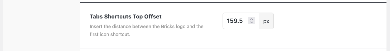
Tabs Shortcuts Offset
With this feature, you can change the distance between the Bricks Logo and the shortcut icons on the left-hand side of the Elements panel.
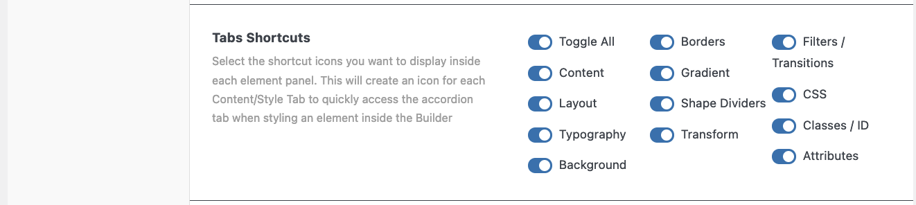
Tabs Shortcuts
Select the shortcut icons you want to display on 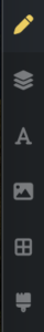 the left side of the Elements Panel.
This will create an icon for each Content/Style Tab in order to quickly access the accordion tab when styling an element inside the Builder.
In order to see the icons you have to select a class or ‘unlock’ an element.

Pseudo Elements Shortcuts
With AT two more pseudo-elements are added.
Select the shortcut icons you want to display inside each element panel. This will create an icon for each status in order to quickly activate/deactivate your pseudo-classes when styling an element inside the Builder.
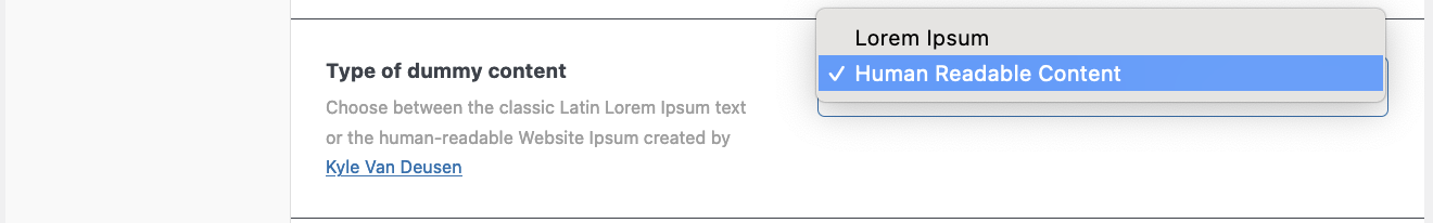
Type of Dummy content
From now on you can choose between the classic Latin “Lorem Ipsus” text or the human-readable “Website Ipsum” created by Kyle Van Deusen.
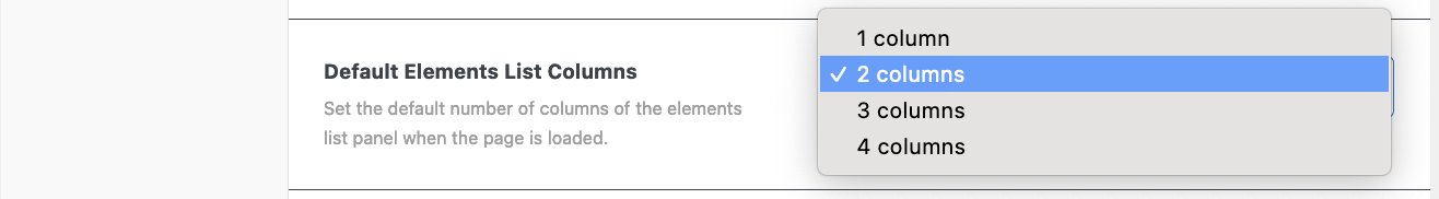
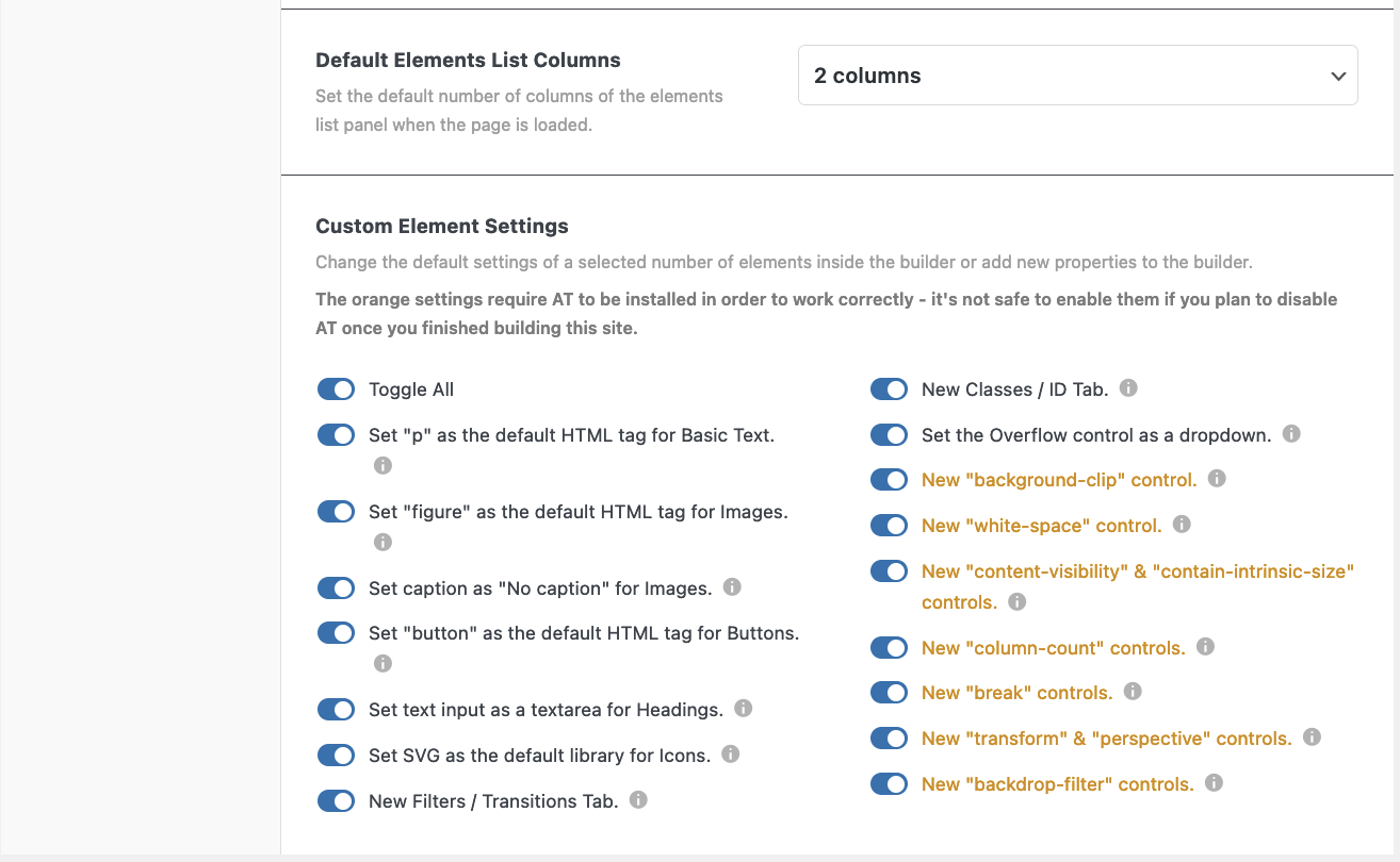
Default Elements List Columns
Set the default number of columns of the elements list panel when the page is loaded.
Choose between a two, three, or four-column layout for your elements.
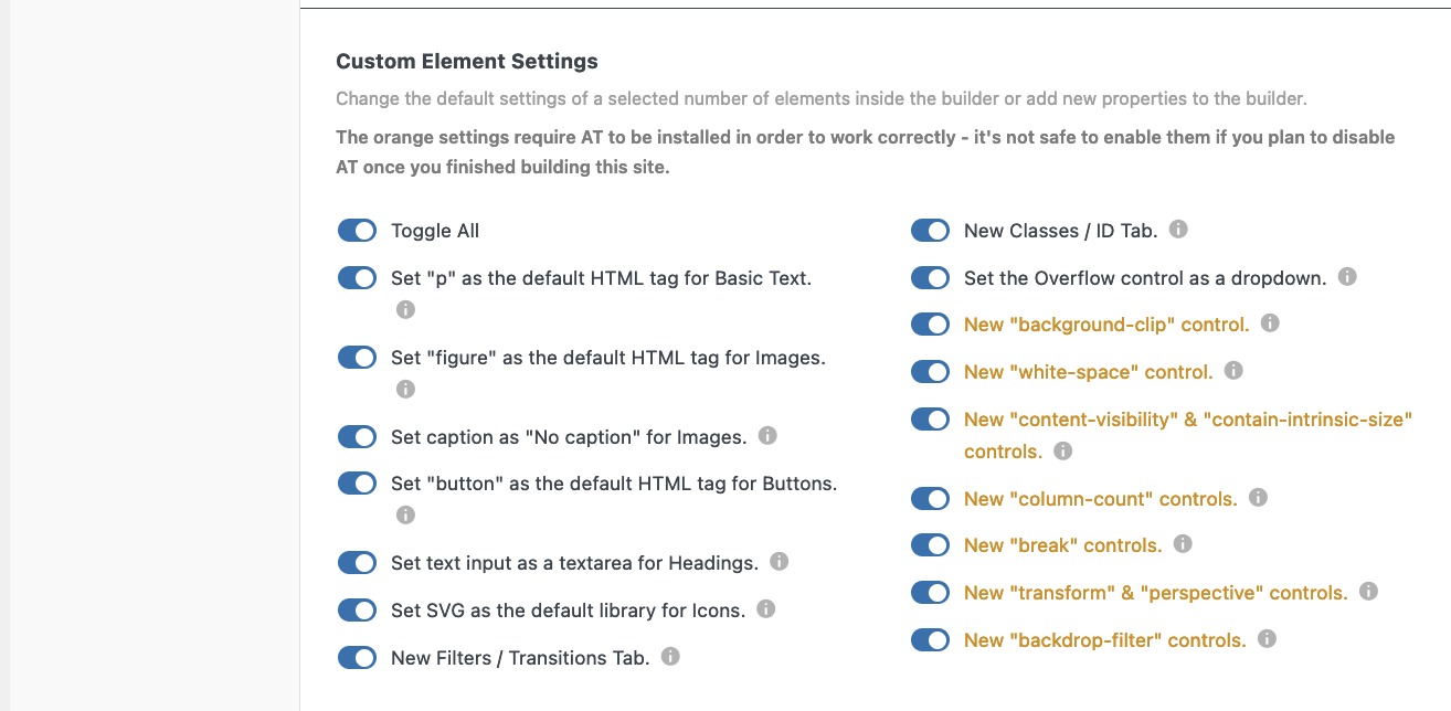
Custom Element Settings
With this part you can change the default settings of a selected number of elements inside the builder or add new properties to the builder.
WARNING! The orange settings require AT to be installed in order to work correctly – it’s not safe to enable them if you plan to disable AT once you finished building this site.
- Toggle All
- Set “p” as the default HTML tag for Basic Text.
- Set “figure” as the default HTML tag for Images.
- Set caption as “No caption” for Images.
- Set “button” as the default HTML tag for Buttons.
- Set text input as a textarea for Headings.
- Set SVG as the default library for Icons.
- New Filters / Transitions Tab. In
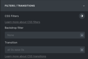 the Style Panel is now a new tab. It is also available as a new shortcut in the left vertical bar.
 - New Classes / ID Tab. This is a new tab as well and the content could previously be found in the CSS tab. This one is also available as a shortcut.
- New “background-clip” control. Can be found in the Style Panel – Background. The next 4 items are in the Style Panel – Layout – Misc, however, not all browsers support these:
- New “white-space” control.
- New “content-visibility” &
- New “contain-intrinsic-size” controls.
- New “column-count” controls. When you select a container/block and select ‘block’ you can now change the number of columns without using flex or grid.
- New “break” controls.
- New “transform” & “perspective”
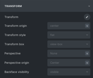 controls. In Style Panel – Transform are a number of new advanced functionalities to be found.
 - New “backdrop-filter” controls.
NB. The Overflow function has a number of 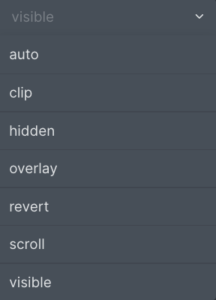 added functionalities as well.