
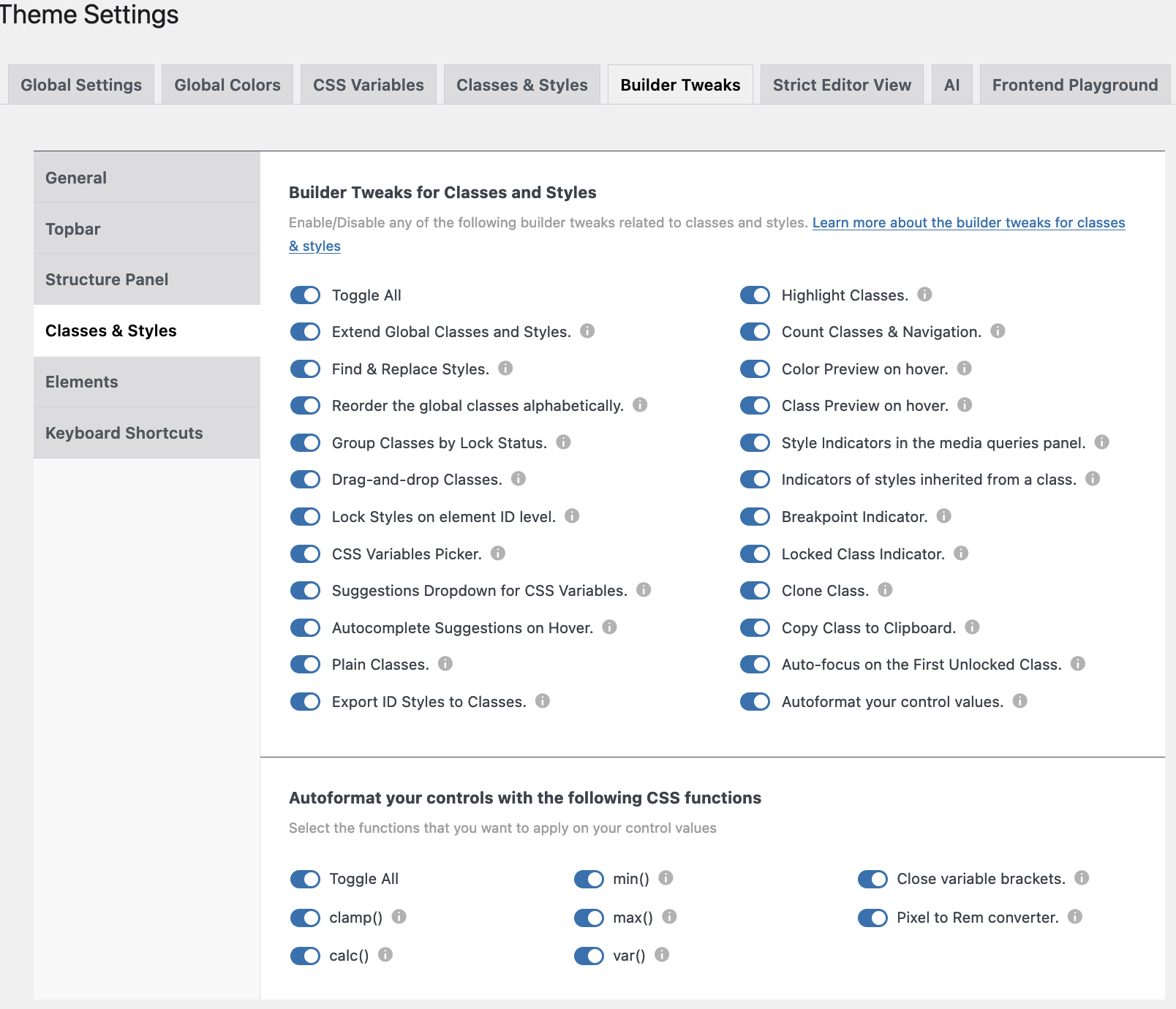
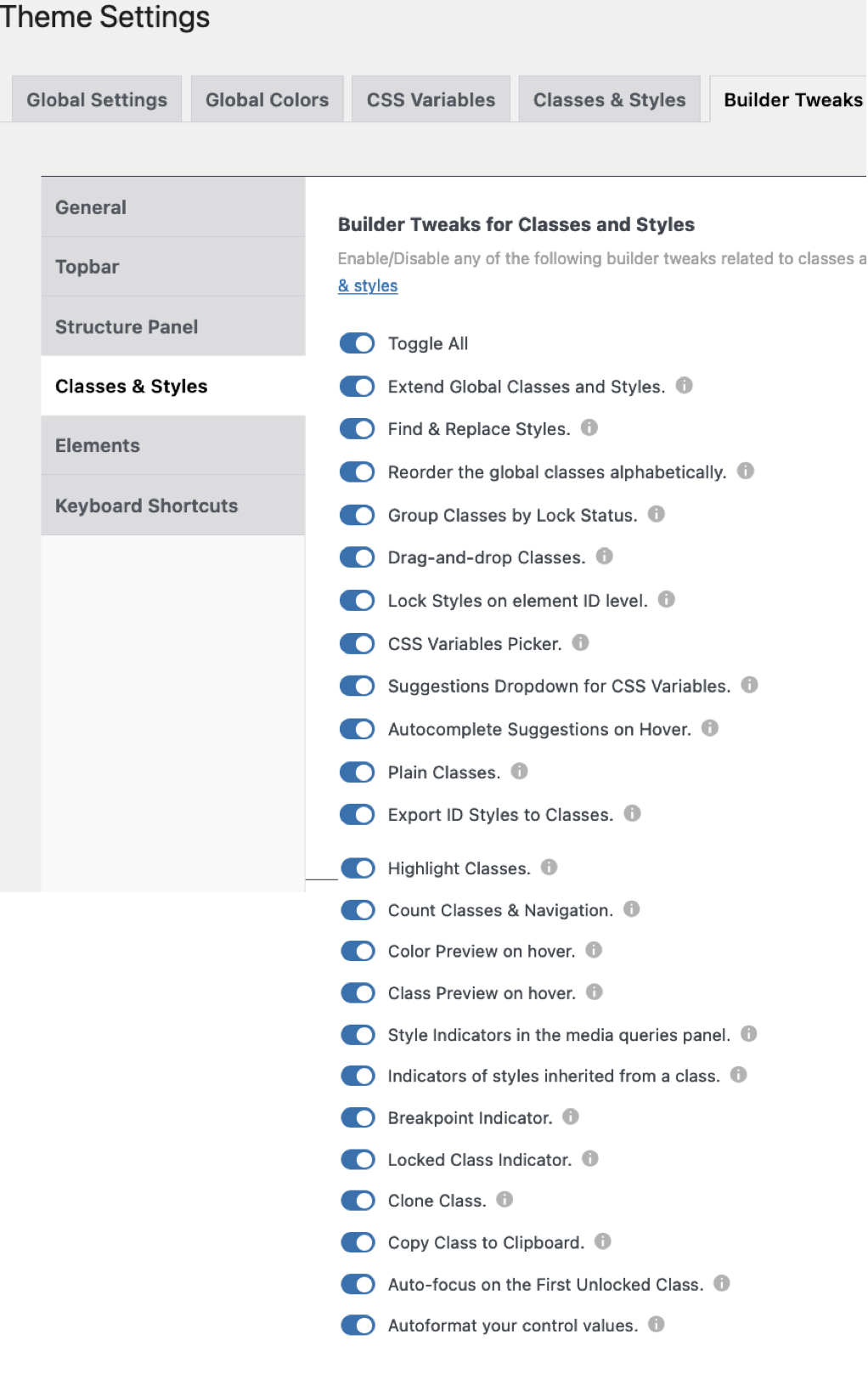
7 Builder Tweaks for Classes & Styles
Tweaks - Classes and Styles
Enable/Disable any of the following builder tweaks related to classes and styles.
Learn more about the builder tweaks for classes & styles.
- Extend Global Classes & Styles. You can extend a class from an element to either parent and/or child elements.
- Find & Replace Styles. You can find and replace any class/style assigned to one element to other elements in the builder.
- Reorder the Global Classes alphabetically. Check this option if you want your global classes ordered alphabetically in the builder.
- Group Classes by Lock status. You can reorder your classes by lock/unlock status.
- Drag & Drop Classes. You can reorder the classes of an element by drag & drop.
- Lock Styles on element ID level. Enable this one when you don’t want to style your elements at the ID level. To unlock just click the lock icon.
- CSS variables picker. When this one is enabled, you’ll see a little ‘v’ in relevant fields. When you click on it a modal will open from which you can choose the relevant CSS variable.
- Suggestions dropwdown for CSS vairables. A bottom popup will show with suggestions for CSS variables.
- Autocomplete suggestions on Hover. When you hover over a CSS variable it will be applied to the field.
- Plain Classes. When checked a new icon will appear next to the element’s class field. When clicked a popup appears where classes can be added/removed (in bulk).
- Export ID styles to Classes. A new icon will appear next to the elements class field. You’ll be able to insert a class name and export all your ID styles to it.
- Highlight Classes. A blue outline will appear around all elements that share the same class, when clicked on it.
- Count Classes & Navigation. A new counter will show next to the class name, showing how many times the class has been used. A click on it will scroll the page to all elements with that class.
- Color preview on Hover. Hovering over a color will apply that color to an element. Nice to preview the effect.
- Class preview on Hover. This will do the same as the previous Color preview, this time with the effect of different classes.
- Style indicators in the Media Queries panel. Whenever you apply a class or style at a certain media breakpoint, a yellow bar will appear underneath.
- Indicators of Styles inherited from a class. You’ll see a blue dot on the left of the controls that have a style generated from an active class.
- Breakpoint indicator. Inside the Style tab you’ll see a small device icon of each breakpoint where a style or class is applied.
- Locked class indicator. A red background will appear when an element is locked. The unlocked ones will have a green background.
- Clone class. A new clone icon will show up once you activate a class. Once clicked, an input field will be visible with the name of the original class, change the name and a new class with all styles of the original one will be saved.
- Copy class to Clipboard. A new clone window will show once a class is activated. A click on the icon will copy the class to the clipboard.
- Autofocus on the first unlocked class. The first unlocked class of the selected element will be enabled instead of the ID style level.
- Autoformat control values. AT will autoformat your control values with functions like: var(), calc(), clamp(), min(), max(), and px to REM converter.
Autocomplete for CSS variables
As of version 1.1. when you select an element and you go to the Style Panel, e.g. Layout—> Width and you either put a value in one of the fields or click on the ‘v’ icon for “Select CSS variable”, whenever you hover over one of the values the changes are immediately visible in the work area. This is also true when experimenting with colors (RAW).
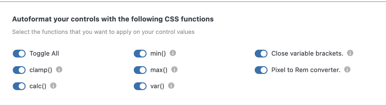
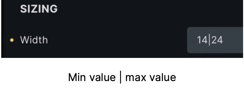
Autoformat your control values
When Autoformat is enabled (version 1.2.4.1) the screen on the left becomes visible.
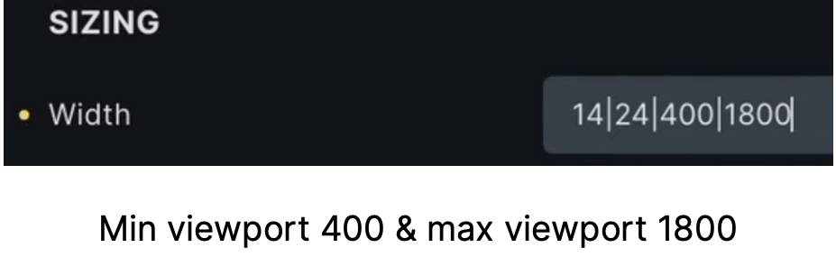
Clamp calculation: e.g. clamp calculation in width will happen automatically when using a minimum value separated by a pipe symbol ‘|’ and a maximum value. You have to give values in pixels, and AT will convert it into rem. However, you can also define alternative viewports as in the images on the left.
Add another pipe symbol and the smallest viewport (400), another ‘pipe’, and then the maximum viewport.
When Autoformat is enabled (version 1.2.4.1) the screen on the left becomes visible.
Clamp calculation: e.g. clamp calculation in width will happen automatically when using a minimum value separated by a pipe symbol ‘|’ and a maximum value. You have to give values in pixels, and AT will convert it into rem. However, you can also define alternative viewports as in the images on the left.
Add another pipe symbol and the smallest viewport (400), another ‘pipe’, and then the maximum viewport.
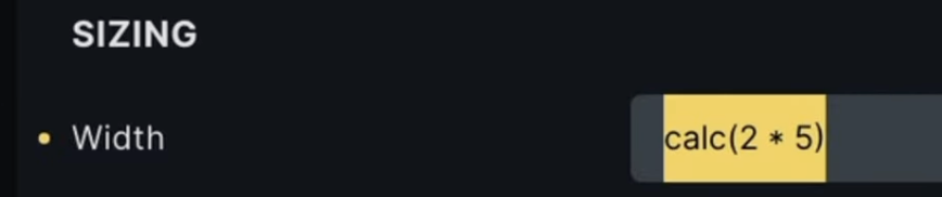
Calc() function
Calc () function: supports the ‘+’, ‘–‘, ‘*’, and ‘/‘.
Min() function
Min function: input “3rem < 20vw” automatically shows the lower image.
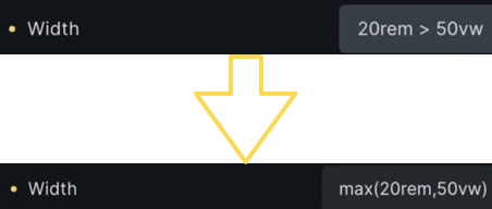
Max() function
Max function: input 3rem > 50vw shows automatically shot below
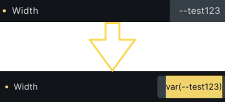
Var() function
Var (): Starting with a double hyphen type the name of your variable and it will be translated into a var.
Close variable brackets: If for some reason you forget to put the closing bracket, AT will now add that one.
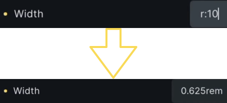
PX to REM converter
Pixel to Rem Converter: When you type r:10 it will automatically be converted to Rem.